In honor of our fifteenth anniversary, we’re reflecting on the evolution of Shades of Green Permaculture. In particular, the evolution of our team, our logo, our office spaces over the years, and our design renderings. When I started the business 15 years ago, I took on one or two projects at a time from my dining room table, hand-rendering designs and doing all of the client management and installation myself. It’s hard to believe it’s been 15 years since those days, but when you look at key milestones and how we’ve grown, the changes and triumphs, and growing pains add up to a company our whole team is super proud of. So, we thought it’d be fun to take a trip down memory lane and share that evolution in photos and graphics.
OUR TEAM THROUGH THE YEARS
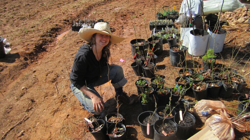
Brandy in 2010 on the first install in Georgia, after relocating from North Carolina.
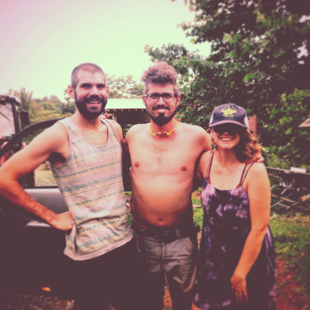
Back when staff meetings were clothing optional…
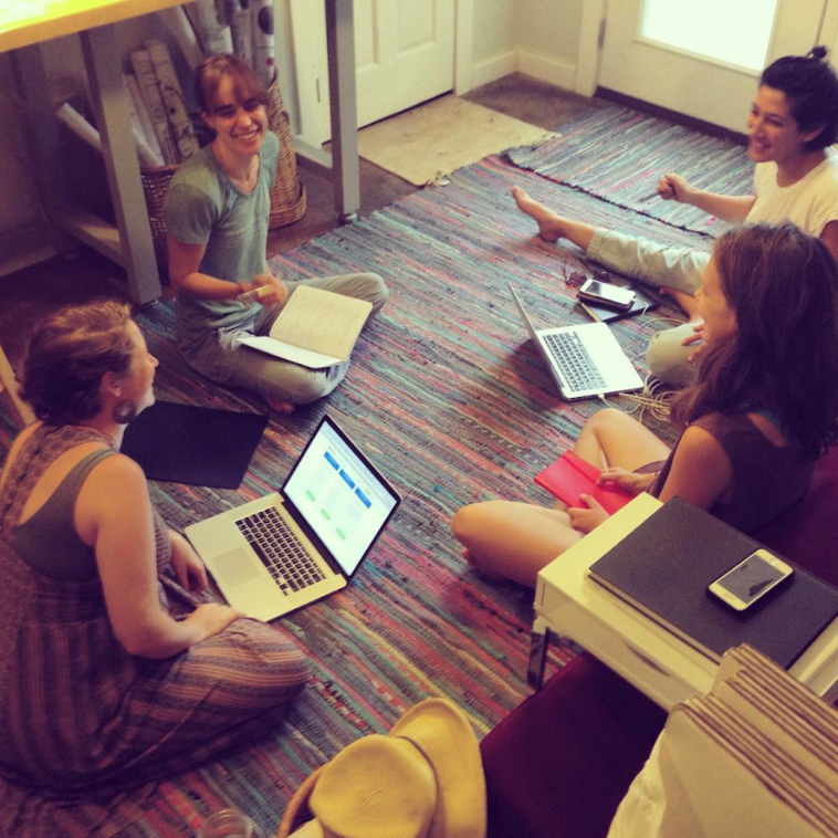
…and still very tiny five years in!
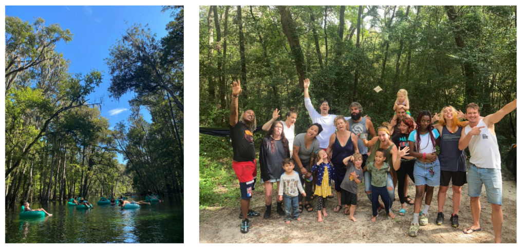
Our staff retreat in 2021, floating down a spring-fed river and enjoying the sunshine!
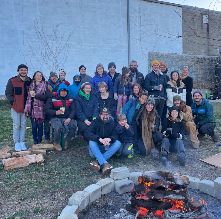
Shades of Green Permaculture team of 20 and families (most of us!) during the end-of-year party in December 2022 on a very cold Atlanta afternoon sipping mead we made together several weeks prior.
OUR LOGO THROUGH THE YEARS
Brandy drew the first logo, and it represented a home being intertwined with the land. Gotta love the deeeeep sepia filter, and the early 2000’s font of choice: Papyrus!
Second try was a little better! Switched up the font, removed the sepia filter…still had a very wordy tagline, though.
We rebranded in 2020, and used a graphic you would find on our plans and drawings as the anchor. We wanted to keep the hand drawn appeal, which had come to be a recognizable part of our brand, while subtly communicating the relationship between plants and water.
OUR OFFICE SPACES THROUGH THE YEARS
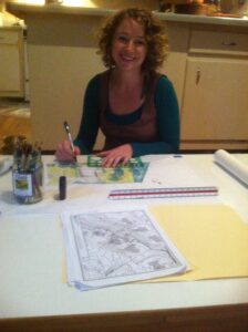
Brandy in 2011 at her dining room table, shortly after taking the leap and making this a full-time gig.
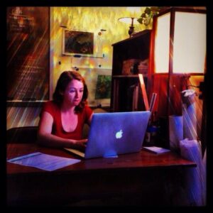
The first ever SOG office in 2012 – a tiny 100SF room in a shared office building. Check out that early aughts filter!
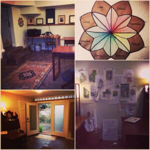
2014 after Brandy and Aaron renovated the basement to become the SOG headquarters. We graduated from 100SF to 150SF! Plus, a garage!
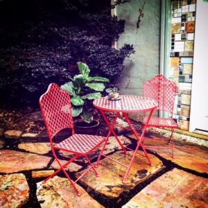
Some outdoor workspace (outside of the basement!) circa 2014.
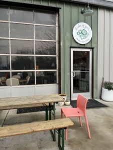
Our current HQ in Avondale Estates at Globe Art Center! Indoor/outdoor connection makes this lovely space feel so good.
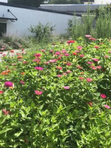
Expansive greenspace outside of our HQ.
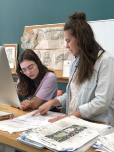
And the inside has plenty of space for our incredible team, plus a kitchenette, bathroom, seed storage area, lounge, and conference table!
OUR DESIGN RENDERINGS THROUGH THE YEARS
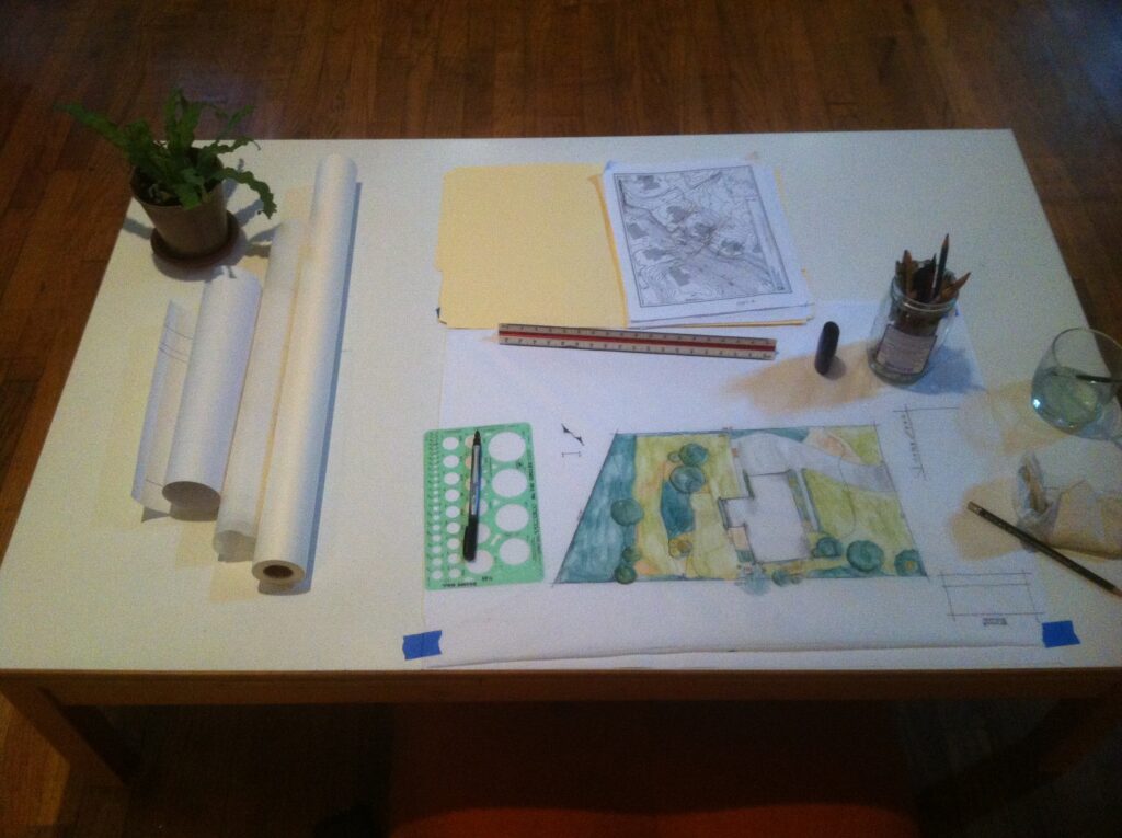
The first rendering set up.
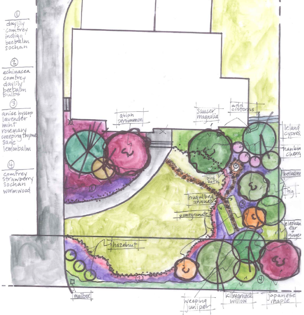
Back when we did design renderings with watercolor pencils, and hand labeling. Eek.
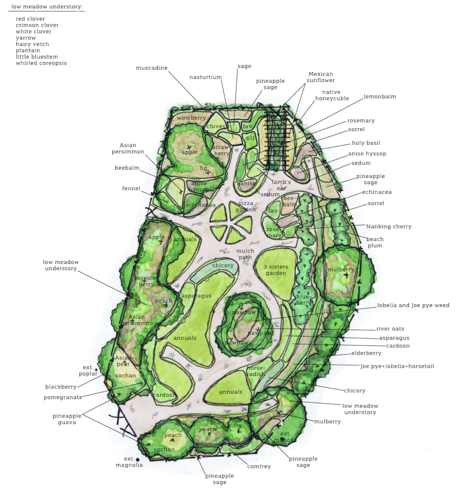
Then we began labeling and formatting digitally, using chartpak markers instead of water color pencils. But, our label lines were still a bit erratic! Clearly, we were self taught!

Finally, a dear friend and landscape architect consulted with us and trained the team in professional rendering, helping set up all of our adobe templates.
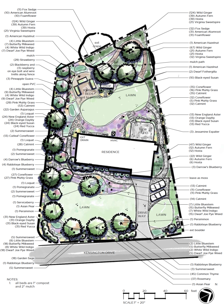
15 years later, we do most of the design work in AutoCAD to help streamline costing, but still keep our hand-rendered flare! Only now, we do the hand rendering digitally, which saves a lot of time and paper.